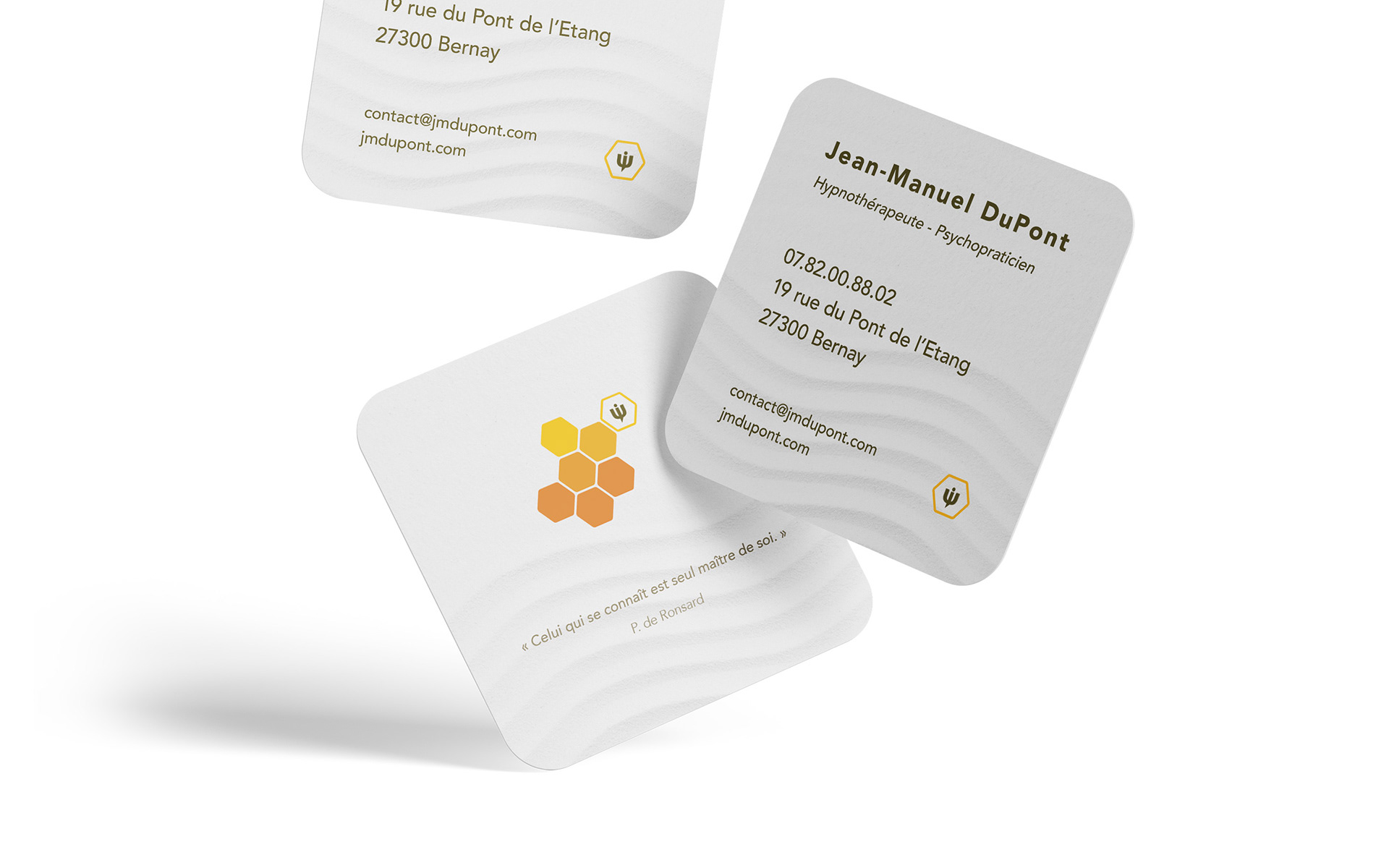
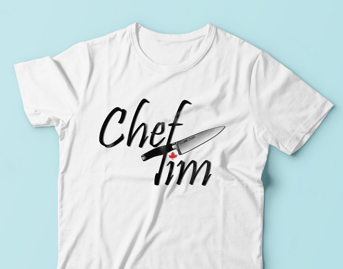
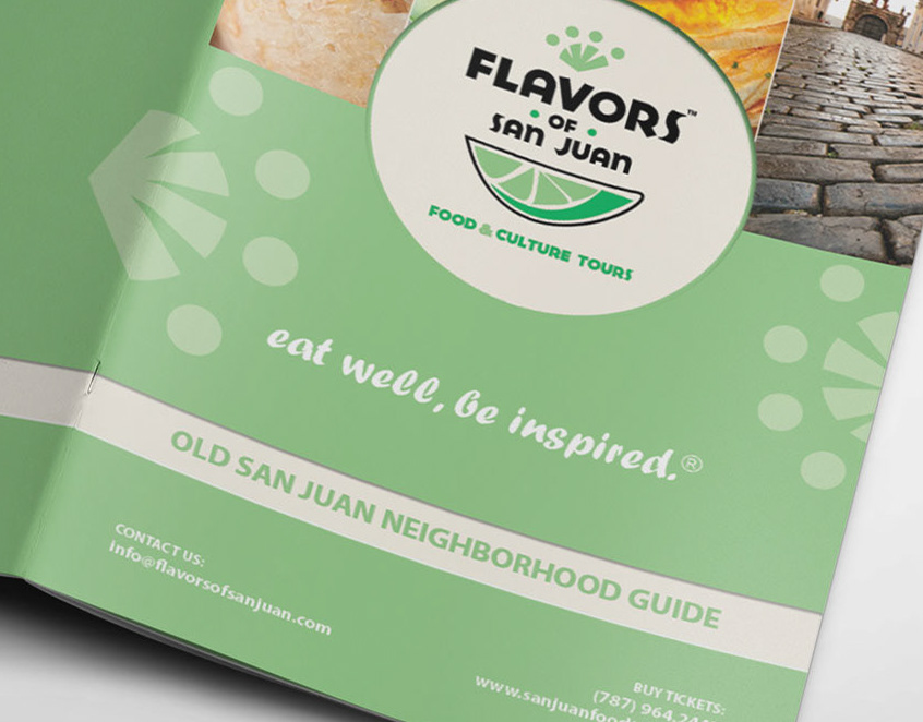


When Jean-Manuel approached me, he sought a visual identity that would authentically capture the essence of his therapeutic practice. He envisioned a brand infused with the power of the hexagon shape, representing harmony, balance, and interconnectedness. Alongside this, he had a specific color palette in mind: vibrant orange, calming blue, and pure white. By ingeniously combining the hexagon shape, the colors orange, blue, and white, and a Zen-inspired theme, we were able to create a brand identity that resonates with Jean-Manuel's therapeutic approach. The hexagon represents the interconnectedness of the mind and body, while the colors orange, blue, and white evoke a sense of serenity, clarity, and purity.